
If there’s one thing we’ve learned from social media, it’s that everybody has an opinion on brands. Often, we first hear about brand messaging from the critics – the recent Dettol campaign proving to be a fine example.
When customers turn from passive buyers into evangelists, they feel an emotional connection with the brand. It’s no wonder, then, that there are such impassioned responses when companies make changes.
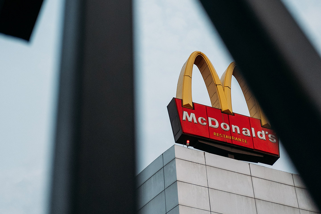
One of the first things we connect with is brand visuals. How many of us can honestly say we’ve never heard of the golden arches, for example?
While many would say that change is part of life, and crucial for brand survival, some designers often miss the mark.
Forgetting provenance
Brand enthusiasts were shocked to see American Airlines dropping their classic 1967 logo after some 46 years. They could have learned from brands like Coca-Cola, who made subtle changes over many years, rather than one huge overhaul.
The airline took the very heart of the brand provenance – the American Bald Eagle – and replaced it with a cleaner aeroplane wing design. Critics said it lacked individuality and could have been ‘any airline on Earth’.
Missing the point
Simplicity may reign supreme in modern-day logo design, but when it dilutes the brand messaging entirely, it’s gone too far. The USA Today newspaper logo underwent a significant design shift in 2012.
What had been a depiction of a bustling globe, racing at a million miles per minute, soon became a plain blue circle. Now, it is little more than a child-friendly graphic – not the symbol of a national publication.
Where have we seen this before?
One theme that seems to be common among logo changes is typeface. Modern-day changes have taken old serif classics and simplified them into friendly, non-serif brands.
Google is a classic example, and other tech giants like Microsoft have followed in its footsteps. With 26% of consumers deeming the change “boring” and 14% reacting with “what were they thinking?”, it seems sans serif is not always appreciated.
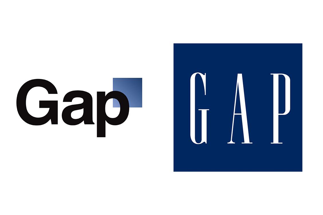
While design trends are a fact of life, too many people jumping on-board kills individuality. Gap learned the hard way in 2010, and was forced to change back to the classic design.
How to update your brand design without pain
These cautionary tales do not spell the end of design evolution as we know it. In fact, many world-renowned logos would raise a few eyebrows if people saw how they started out.
If you’re refreshing your look, remember to:
- Change little and often. BMW has made subtle changes over the years, and while it’s not always impressed designers, it’s not harmed brand loyalty.
- Reflect your values. Your company values will change as your business grows. BMW said their look was “adapted for the digital age”, for example.
- Trial it with focus groups. Had the 2012 London Olympic logo had a little more testing, it may not have attracted a petition signed by 48,000 people!
- Always ask an expert. You may be working with a designer, but remember to consult a wider team as well. Branding strategists will understand the psychological effects of even the subtlest changes, so always consult before you publish.
If you’re looking for a branding expert in Preston, Chorley or Leyland, get in touch with Tall Zebra Designs.