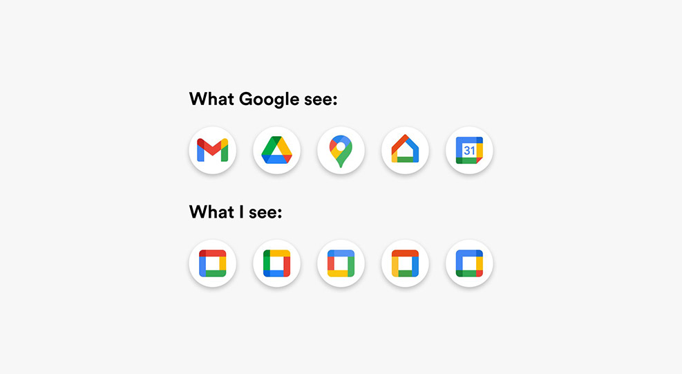
You’ve probably seen the latest tongue-in-cheek Google meme making the rounds on social media.
As part of the “reimagination” of G Suite, Google has taken its previously distinctive icons and merged them with a rainbow design. Squint too hard, and you could be forgiven for thinking all its services look the same.
The overhaul affected Google’s core services such as:
- Gmail
- Google Calendar
- Google Drive
- Google Docs
- Google Hangouts.
While some degree of uniformity is essential to maintain a consistent brand, many would argue that Google have taken this a step too far.
So, from a UX perspective, why is iconography so important in branding?
Quick navigation between tabs
If you’re anything like our web design studio team, your browser is a lot like your brain: running a thousand tabs at once. That’s great if you’re multi-tasking, but it does make those tabs look a little crowded.
One way to navigate seamlessly from one tab to another is to look at the favicon. This tiny symbol is usually a thumbnail of the company logo. For example, you’d recognise the favicon in the Apple tab from a mile away.
If all your icons look the same, this could potentially slow down the user experience. The same goes for storing bookmarks – users don’t want to have to read the tab. It should be instantly recognisable by a distinct symbol.
Cross-device access
Swimming in smartphone apps? With operating services adding updates like they’re going out of fashion, it’s hard enough to become accustomed to a new home screen. Add a whole suite of similar-looking app symbols into the mix, and you’re in for a swiping nightmare.
Companies offering a range of different services through mobile apps like Google Drive would do well to keep their designs unique. It saves crucial seconds flicking through screens – and as we all know, those seconds could make or break conversion rates.
Improving accessibility
The key role of an icon is to tell a story or give instruction. The floppy disk symbol may be lost on Generation Z users, but it’s universally known as the ‘save’ function. In the absence of text, or indeed, for users with visual impairments, icons serve a vital purpose.
In this case, web designers should go for substance over style – a simple outline drawing, for example, an envelope to indicate sending an email. This will aid users through simple navigation, and lead to easier conversions.
Versatility across all channels
Unlike other mediums, icons are not limited by factors like image size, print or digital, or device compatibility. They’re usually made with a simple graphics file designed in PhotoShop or similar, which means you can use them across all mediums.
Add icons to infographics, social media posts, website navigation, print medium and more without a hassle. You can also make them your own, as seen here – and carry that design consistency across all marketing materials.
Stuck for illustration ideas?
We’re not all born Picassos, so if you’re lacking a little design inspiration, speak to the Tall Zebra Designs team. Our talented designers and illustrators can provide a whole suite of symbols to help your brand stand out.